Multi devices responsive website mockup
in Mockups
DOWNLOAD NOW Report
83
12
1
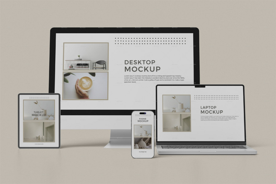
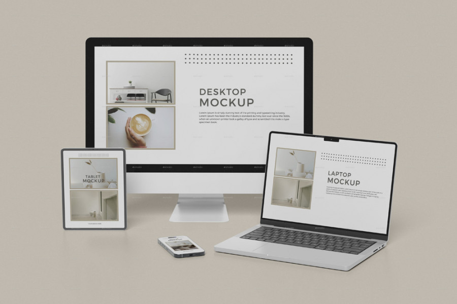
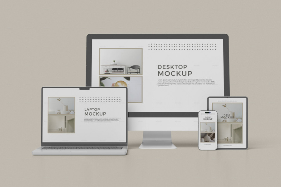
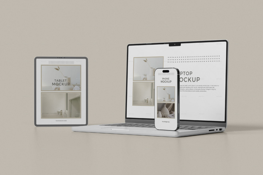
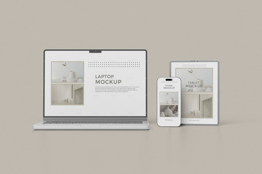
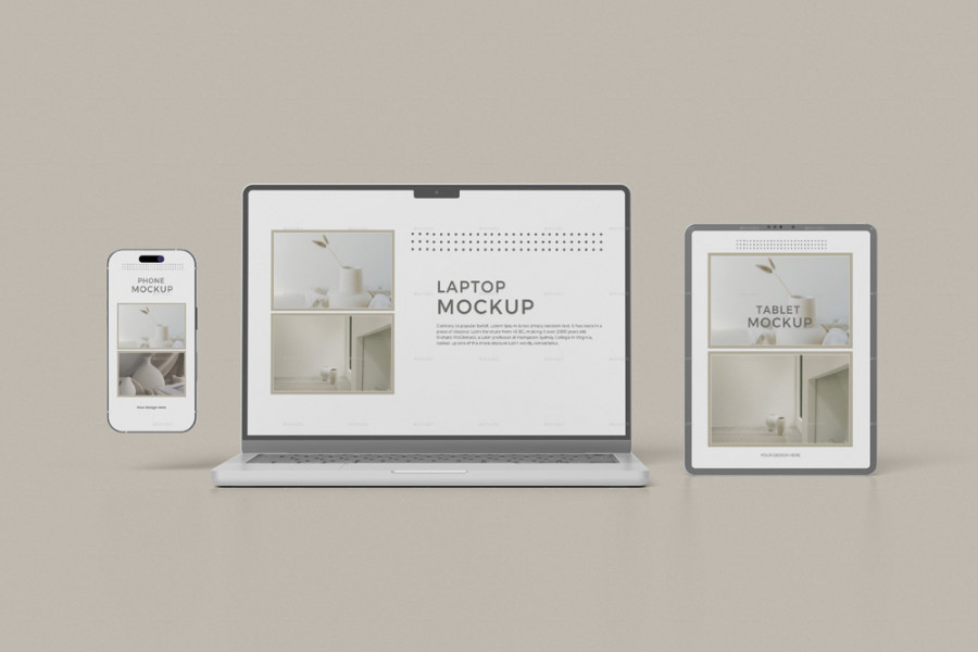
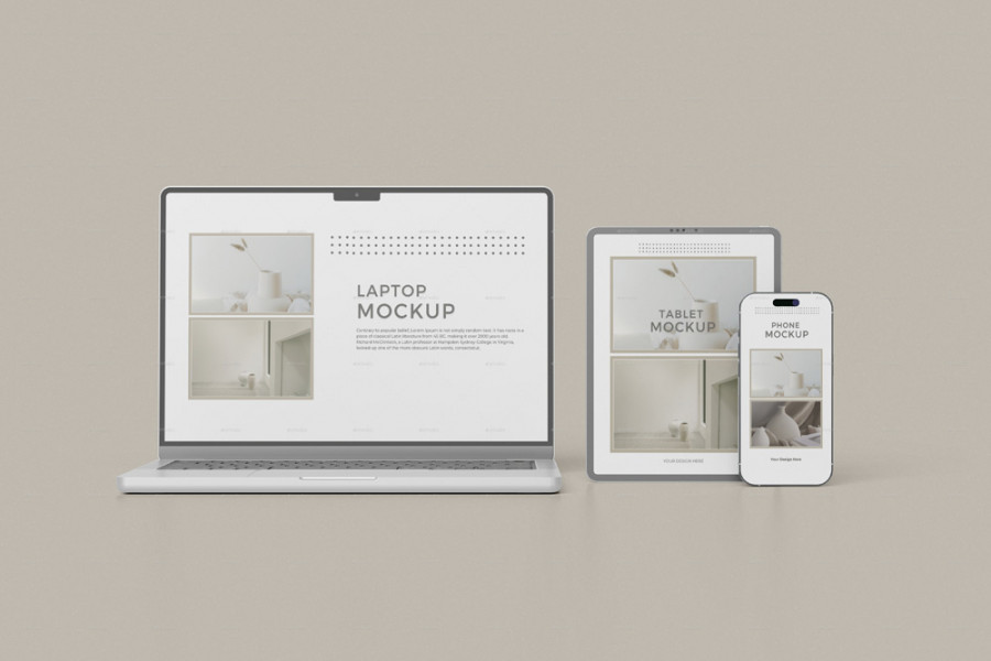
Responsive Multi-Device Website Mockup
Present your designs in a realistic and professional manner with our Multi-Device Responsive Website Mockup. This mockup, provided as a fully editable Photoshop file, allows you to display your work across multiple devices. With its smart object functionality, editing is quick and effortless—simply double-click on the smart object layer thumbnail, place your design, and save the changes.
Features:
- Quick and easy editing using smart objects
- Well-organized layers and folders for smooth workflow
- Suitable for both light and dark design themes
- Customizable background colors
- Light adjustment capabilities
- High resolution: 4500×3000px
- 300 DPI for sharp, print-ready quality
Included:
- 08 PSD files
- PDF guide for easy instructions
This mockup makes it simple to present your responsive website designs across various devices with a realistic look.